Tuesday, February 17, 2009


Word mark, I am designing to reflect my own identity.

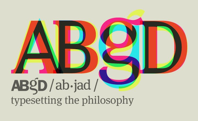
Word ABgD (pronounced Abjad) literally means letters A B G and D representing the original order of Phoenician alphabets. The closest example today can be seen in Greek (Alpha, Beta, Gama, Delta). Abjad is a type of writing system in which each symbol stands for a consonant; the reader must supply the appropriate vowel. This is the very philosophy that I practice under brand name ABgD - I provide consonants and the client provides the vowel. The contribution of client is important as it gives meaning to my work.

All known abjads belong to the Semitic family of scripts. These scripts are thought to derive from the Proto-Sinaitic alphabet (dated to about 1500 BC) which is thought to derive from Egyptian hieroglyphs. The abjad was significantly simpler than the earlier hieroglyphs. The number of distinct glyphs was reduced tremendously, at the cost of increased ambiguity.

The first abjad to gain widespread usage was the Phoenician abjad. Unlike other contemporary scripts, such as Cuneiform and Egyptian hieroglyphs, the Phoenician script consisted of only about two dozen symbols. This made the script easy to learn, and Phoenician seafaring merchants took the script wherever they went. Phoenician gave way to a number of new writing systems, including the Greek alphabet, the first “true” alphabet, and Aramaic, a widely used abjad. Greek evolved into the modern western alphabets, such as Latin and Cyrillic, while Aramaic became the ancestor of many modern abjads and abugidas of Asia.

Aramaic spread across Asia, reaching as far as India and becoming Brahmi, the ancestral abugida to most modern Indian and Southeast Asian scripts. In the Middle East, Aramaic gave rise to the Hebrew and Nabataean abjads, which retained many of the Aramaic letter forms. The Syriac script was a cursive variation of Aramaic. It is unclear whether the Arabic abjad was derived from Nabatean or Syriac.

I hope you like the concept and design. I am open to ctritique - to learn and to proceed.

Friday, January 16, 2009

Mr. Edison's Ear - Fransisca Duran
Canada in the making - culture and contribution

Canadian money has remained stagnant with images of great men and women who shaped the country politically. What Canadian money lacked is the representation of the common people that build this great country. For this reason we (it was a group project - thanks to Dylan, Andrea and Breannen for their contribution) decided to show the greatness of these Canadians in terms of culture and contribution throughout the history. Each bill has an illustrative obverse side with cultural representation, and the reverse side with their historical contribution towards making of Canada.

$5 Banknote - Native contributio
n

$10 Banknote - European contribution

$20 Banknote - African contribution

$50 Banknote - Asian contribution

$100 Banknote - Our contribution
Bodyshop Fair Trade illustration
Arabic lllumination in Century Gothic
Century Gothic is used in this specimen to create an Arabic Illuminated poster. Thanks to perfect lines and curves of Century Gothic.
International Human Rights Stamp Series - Canada
Typographic symbols from different languages were chosen to represent four separate articles from the International Human Rights Charter, to complete the series of four Canada postage stamps
.

Ephemeral song posters
So the task was to make a song poster using only the lyrics to represents ephemeral qualities of the sound, the music and the meaning of the song. The toughest part was to make something that sings to you. I ended up doing two posters.

Only time - Enya
The musical sound of enya is represented in this poster for her song Only time! The use of ultra thin typeface matches her feminine voice and ripply effect created by the lyrics well represents the nature of the song.

Mr. Bobby - Manu Chao
ROM promotional brochure/editorial
Front and back cover of my ROM editorial.
Toronto Tear Jerkin' Film Festival
The film festival features the films that make people shed tear. The first concept is power of the tears, as when they are shed for a purpose are so powerful that they can break a heart. The second concept features the value of tears, as when they are shed in true love are as powerful as gems.
Molecular Biology Research Poster
The sequencing of Chromosome one is featured on this research promotion poster.
Century Gothic Typoster
Century Gothic is one of my favorite typefaces due to its almost perfectly geometric shapes making it very flexible typeface to be used in a variety of contexts.

University of Cambridge British Music Poster
British Music Week was celebrated by the Faculty of Music at University of Cambridge, UK.

Aluminum cans recycle steps project
A few shots from my aluminum can recycle project.
Romeo & Juliet Drama poster series
A series of posters were created to advertise the premier of the show.